Tuesday, December 18, 2007
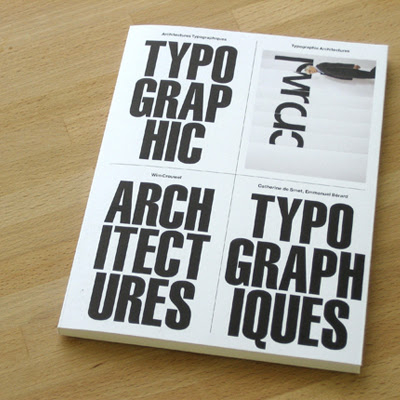
with a K—Wim Crouwel
What happens when Experimental Jetset designs the bilingual catalog from the Galerie Anatome exhibition of Wim Crouwel.
Modernist excellence.
Purchase it here.
with a K—Bend The Void
There is a reserved shelf at home for Geoff McFetridge.
Bend The Void, entered With a K Library November 15, 2007.
This book makes loneliness feel comforting.
Purchase it here.
becca—Single Copies $1.00 Each
For those who don’t have the means to time travel I recommend buying a lot of National Geographics off ebay.
Featured ads from: Charles Harper & Erik Nitche
Scott—Constatine Sankathi
An amazing hardcore band from the Midwest back in the mid 90’s.
I found this discography online about a year ago, containing
all the tracks I once had on vinyl 7 inches. The silkscreened cover
art and the craft paper packaging only added to the personal
value of this album.
Lyrically, I was always moved; instrumentally, in awe at their willingness
to explore areas they weren’t necessarily good at—ie. adding a horn
section that, quite honesty, sounded horrible. But I love every minute.
Breaking away from that safe zone is always hard—no matter what
you are doing—but often provides some of the most refreshing results.
‘The moon has given the setting sun its demands, so now we ride …’
Scott—Old, Faded, Still Effective.
Thursday, November 8, 2007
becca—One One Nine
It’s been a lifelong dream to produce a little ‘zine’, but until I get off my ass and do it, I’m left admiring peoples who have. I ordered a copy of One One Nine on an impulse. I saw that Up North curated it and decided to give it a go.
I must admit I was disappointed. The whole thing feels disjointed. At first glance I thought there was a theme that linked the illustrations, but when I received my (pretty beat-up) copy in the mail I was disheartened that there was no common thread. It acts primarily as a showcase for illustrators, some of which are quite good but most feel rather contrived.
I’m left wondering what’s the point.
I respect the fact that they were able to get some names together and ultimately produce something and I understand that they were “curating”. However, I wish more thought would have been put into the final outcome. There isn’t even an upfront piece to explain why they wanted to do this.
Anyway, it was good for a few quick flip-throughs, but this will probably float around my apartment for a while before getting filed into a magazine racks to possibly never be seen again.
Wednesday, November 7, 2007
becca—faux-realism
Simen Johan first caught my eye with a series of shockingly eerie images that depicts children in (seemingly real) concerning situations. He has since released a series called “Until the Kingdom Comes” which is equally as impressive, and included some sculpture pieces that took me by surprise.
His images are captivating and puzzling. They leave one wondering how this is possible, questioning the situation; and when the realization comes that the work is indeed fantasy, pondering the origin and
intent of the imagery.
Beyond content, Johan’s technique is amazing. One of my favorite things about him is that he works with film. The images are scanned and then manipulated digitally, giving a richer and more honest appearance to the faux-realism.
Check out lifelounges’s interview with him, he describes his subject matter and the motivation behind the imagery far better than I have.
with a K—Gin & Tonic, Please.
This last May a friend mentioned that Philip Johnson’s Glass House was opening to the public. The only work I knew of Johnson was the Glass House. My impression of the house was based on photography that captured this beautiful glass structure surrounded by a perfectly mowed lawn and artistically trimmed trees. Not wanting to feel left out, I joined 9 other friends for a tour that was not happening for another 5 months. Along comes October 30th, we head to New Canaan to visit the Glass House. The van slowly rolls onto the property through a gate made up of two colossal sized columns. For two hours we walked around the 47-acre estate. Every direction you look presented a perfect balance of object, nature and space. There are certain pivotal moments in your life when an experience changes you. I have marked this day as one of them.
Monday, November 5, 2007
with a K—I like layovers.
Thanks to Munich airport, I am a believer in the casual layover.
To validate my new optimism here are photos of my German layover experience.
Here is my 5 step guide to killing 6 hours before your flight.
(1) Camera opportunity
Floor to ceiling windows make for scenic panoramic of the tarmak.
(2) Time trials
Want to feel like an airport athlete? Clock yourself with these
hanging clocks featured every 50 feet throughout the entire terminal.
(3) Furniture design
Modern and comfortable, that’s how these Germans roll.
Take a break on one of these (note: try laying down
they welcome long naps)
(4) Typography
In case you did not know “M” is for Munich.
(5) Customer Service
After the 4 prior tasks are completed. Go crazy and sweet talk
a Lufthansa representative into giving you an exit row seat for
more leg room.
For more info on the following:
Munich Airport
Haben Sie einen sicheren Flug,
With a K
Thursday, September 13, 2007
Week 5: with a K—Viva La France
Not having access to rural yard sales or “cheap” flea markets the canny shopper is left to sift through piles of web auctions in order to find treasures worthy of entering a athenaeum. On a recent Ebay binge I came across a book called, “Effets Graphiques Dans Les Plans De Construction / Graphic Effects in the Plans of Construction” by Gerd Zimmerschied. Not knowing what the contents of the book looked like. I took a gamble based off the sellers photograph of the front cover. Thankfully, this 10 dollar purchase was worth the high price tag. The book is a visual compendium of architectural drawings that include: trees, people, animals and automobiles. The variation of illustration styles and techniques are endless. A real find for anyone looking for illustration inspiration. Offrir heureux!
week 6: becca—Barcodes?
With the release of the iPhone, it is becoming easier and easier to access information, especailly on-the-go. If only there were a way to visually link what we are seeing to the information accessible. For example, let's say you visit the Brooklyn Bridge and want to know how long it is , is there a way to visually link you to this information?
Well actually there is. Barcodes, yes, barcodes. A coding technology has been developed that turns a URL address into a barcode, or in the case above a "Semacode". So, if you were to take a photo of the barcode with your camera phone, it would be able to decode it and link you to that website. There are a lot more possibilities for this technology and I'm sure they are just beginning to be tapped.
Oh and the Brooklyn Bridge is 5,989 feet long, just in case
you were curious.
Week Six: Scott—The Filth
The Filth is a comic book series by Grant Morrison, Chris Weston and Gary Erskine that was released thru DC Comics. A number of covers were designed by a fine studio in Chicago called Segura, Inc.
I became aware of these designs after a studio visit in 2006. Carlos Segura mentioned they were no longer being produced and were extremely hard to find. Fortunately for designers looking to collect hard to find design pieces, eBay becomes a good friend.
I found the lot the following day—mint condition, all but one in, what appears to be, the original plastic packaging.
Check out the site for other fine design work by Segura, Inc. and to see all 13 covers.
Thursday, August 30, 2007
week 5: becca - [Art]ifact
Victionary has released a new book called [Art]ifact, Re-recognizing the Essential of Products. This publisher has the unique ability to find things that are not only well conceived and designed, but also most projects are work that hasn't circulated the blogs. This recent release is no exception. It starts with a brief preface discussing the traditional concepts of from and function, and the breaks the work featured in to three categories: Observative + Augmentation, Fun + Function, and Interactive + Sensation. The book features some outstanding work and makes some insightful observations on the contemporary approach to product design.
Friday, August 24, 2007
Week 4: becca - Polaroid OneStep
While searching for my new Yashica rangefinder on ebay a few weekends ago, I ran across a vintage Polaroid OneStep and impulsively bought it. What made this particular listing more appealing than the ones I normally come across was that it included the original packaging. Polaroid’s branding during this time (1957-1977) was mainly done by a man named Paul Giambarba, he was a freelancer that they hired with sole purpose to out-do Kodak (who were already using their iconic yellow boxes). His first move was to redo the logotype and introduce simple color coding. Eventually this lead to the introduction of a series of rainbow like stripes that appeared on both the packaging, and the cameras. His work at Polaroid concluded with a radiating, striped, square that changed location with each new series of packaging. The evolution of this packaging is truly a stunning example of how to grow a brand and is definitely worth reading about.
Monday, August 13, 2007
Week 4: with-a-k - Hrvatska grafiska
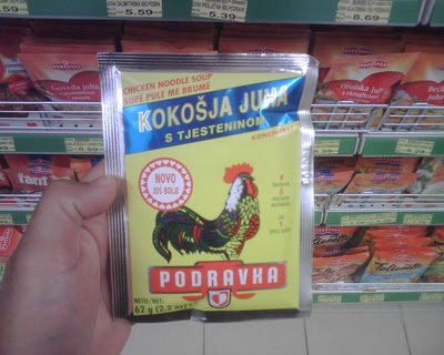
Today, my parents sent my brother and I on an errand to pick up groceries at Tommy's in Opuzen, Croatia. While filling our cart, I took the opportunity to document my favorite food packaging in Croatia. My admiration for these products are apparent in their simplicity of type, color and composition. Many of these packaging have not changed since the days of Yugoslavia. It is nice to visit a part of the world which does not turn as fast as the rest. It is a good place to sit, observe, collect your thoughts, and find design inspiration. Ja volim moja Hrvatska!
Thursday, August 2, 2007
Week 3: becca - grafik 150
I’m usual quite disenchanted with a lot of design magazines, however I’ve always been impressed with the way Grafik seems to always bring something fresh to the forefront.
This year they’ve already caught me off guard twice, first with the jaw dropping screen-printing job that K2 did for them on issue 150, and now with the book Grafik 150 they’ve released to coincid with their
150th issue celebration.
Despite it’s minute size, this book packs a lot of punch. It features 150 globally renowned designers simply writing about what inspires them, and placing an image on the adjacent page. The content is indulgent in the way that only a creative person speaking to another creative person can be, and the tonal range proves to be equally as interesting. The last spread is saved for Peter Saville. He not only simplified this mini assignment to a new degree, but also summed up the book rather well, writing/drawing “What I see” and “What I feel” on opposite sides of the page, and then connecting them with arrows that form an over all circler shape.
Week 3: Jeremy - Design With Dice
“Consistency is the last refuge of the unimaginative.”
The image above is by the design group Tomato. Anyone familiar with their work will appreciate their seemingly random, yet perfectly composed, dynamic (almost in motion on the page) aesthetic. I would be lying if I said I haven’t tried to emulate their print and motion before, un-successfully. Then I heard this piece of music.
In 1964, Terry Riley composed a aleatoric musical piece called In C. He composed 53 short musical phrases, and suggested that the individuals in the orchestra play them arbitrarily, for a duration of 45 minutes to 90. ‘Aleatoric’ comes from the word Aleator, which means ‘dice player’. There in lies its beauty – the piece is so dynamic, so inspirational, because its a gamble – success is far from guaranteed. It is random, utterly dynamic, yet perfectly composed.
To bring this very abbreviated story full circle, I discovered that this piece changed the course of 20th century music massively influencing Philip Glass, Steve Reich, The Who (Bubba O’Riley, Won’t get fooled again), Charlie Mingus (Haitian Fight Song) and perhaps most interestingly to me, Tomato’s musical splinter Underworld. Make of that what you will.
Week 3: with-a-k - Tube Bender
One can't help but notice the diverse spectrum of neon signs in
New York City.
I often find myself walking aimlessly to find these gems. Funny enough, the businesses that use them are unique as their hanging counterparts. The city is a myriad of inspiration. Neon signs are one of many things that catch my eye. So, this is my post that pays homage to this 150 year old format and the people responsible for crafting them.
…
"Get your neon keen on" brought to you by, The Tube Benders of America
Thursday, July 26, 2007
Week 2: with-a-k - It's all about the taco
If you’re a Californian living in New York you’ll understand the reasoning for the illustration above. Lately, my longing for good Mexican cuisine has me frantically searching for the best taco in town. Unfortunately, this quest has yet to uncover any savory spots. In the meantime, making illustrations of food I fantasize over is good therapy. Thanks for caring.
Week 2: becca - Arron Siskind
“If you look very intensely and slowly, things will happen that you never dreamed of before.”
- Aaron Siskind
Photography for me has always been something I just did. I can’t recall how many times I got in trouble as a child for stealing my fathers SLR. Taking what, to him, seemed like ludicrous photos of peeling paint or cracks in the pavement. However, it wasn’t until I discovered the work of Aaron Siskind that I realized how powerful and provocative these abstract images could actually be.
From the Phaidon 55 book on Siskind:
“Aaron Siskind’s towering presence in the landscape of twentieth-century American photography rises from two foundations of accomplishment and influence – his art and his teaching. Beginning in the early 1930s and continuing until his death at eighty-seven in 1991, his copious production of varied and highly creative images created a legacy of original vision which eventually obliterated whatever line might still have seemed to segregate photography and painting in the 1940s and 1950s… Siskind’s manner of zooming in on visual details and fragments in ways that explored gesture and shape but that had little to do with the nominal subject matter in front of the camera clearly made him a brother in the family of
Abstract Expressionism.”
Week 2: jeremy - hi/low
Cyclist Michael Rasmussen was my hero. Yesterday he was kicked out of the Tour for doping. From childhood I have always loved the red polka-dot jersey awarded to the best mountain climber of the Tour de France - Luis Hererra, Stephen Roche and for the last 2 years Michael Rasmussen. So while I'm in the market for a barely legal 14 lbs racing bike, and 'gutted' over the betrayal by my hero, I also captured an image of perhaps the earliest and most purely exciting type of bicycle riding - sitting on the cross bar of an older siblings beater. Hi design or low design - enjoy the
ride, and don't cheat.
Subscribe to:
Posts (Atom)