Thursday, August 30, 2007

week 5: becca - [Art]ifact


Victionary has released a new book called [Art]ifact, Re-recognizing the Essential of Products. This publisher has the unique ability to find things that are not only well conceived and designed, but also most projects are work that hasn't circulated the blogs. This recent release is no exception. It starts with a brief preface discussing the traditional concepts of from and function, and the breaks the work featured in to three categories: Observative + Augmentation, Fun + Function, and Interactive + Sensation. The book features some outstanding work and makes some insightful observations on the contemporary approach to product design.

Friday, August 24, 2007

Week 4: becca - Polaroid OneStep


While searching for my new Yashica rangefinder on ebay a few weekends ago, I ran across a vintage Polaroid OneStep and impulsively bought it. What made this particular listing more appealing than the ones I normally come across was that it included the original packaging. Polaroid’s branding during this time (1957-1977) was mainly done by a man named Paul Giambarba, he was a freelancer that they hired with sole purpose to out-do Kodak (who were already using their iconic yellow boxes). His first move was to redo the logotype and introduce simple color coding. Eventually this lead to the introduction of a series of rainbow like stripes that appeared on both the packaging, and the cameras. His work at Polaroid concluded with a radiating, striped, square that changed location with each new series of packaging. The evolution of this packaging is truly a stunning example of how to grow a brand and is definitely worth reading about.

Monday, August 13, 2007

Week 4: with-a-k - Hrvatska grafiska


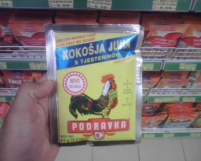
Today, my parents sent my brother and I on an errand to pick up groceries at Tommy's in Opuzen, Croatia. While filling our cart, I took the opportunity to document my favorite food packaging in Croatia. My admiration for these products are apparent in their simplicity of type, color and composition. Many of these packaging have not changed since the days of Yugoslavia. It is nice to visit a part of the world which does not turn as fast as the rest. It is a good place to sit, observe, collect your thoughts, and find design inspiration. Ja volim moja Hrvatska!

Thursday, August 2, 2007

Week 3: becca - grafik 150


I’m usual quite disenchanted with a lot of design magazines, however I’ve always been impressed with the way Grafik seems to always bring something fresh to the forefront.

This year they’ve already caught me off guard twice, first with the jaw dropping screen-printing job that K2 did for them on issue 150, and now with the book Grafik 150 they’ve released to coincid with their
150th issue celebration.

Despite it’s minute size, this book packs a lot of punch. It features 150 globally renowned designers simply writing about what inspires them, and placing an image on the adjacent page. The content is indulgent in the way that only a creative person speaking to another creative person can be, and the tonal range proves to be equally as interesting. The last spread is saved for Peter Saville. He not only simplified this mini assignment to a new degree, but also summed up the book rather well, writing/drawing “What I see” and “What I feel” on opposite sides of the page, and then connecting them with arrows that form an over all circler shape.

Week 3: Jeremy - Design With Dice


“Consistency is the last refuge of the unimaginative.”
The image above is by the design group Tomato. Anyone familiar with their work will appreciate their seemingly random, yet perfectly composed, dynamic (almost in motion on the page) aesthetic. I would be lying if I said I haven’t tried to emulate their print and motion before, un-successfully. Then I heard this piece of music.

In 1964, Terry Riley composed a aleatoric musical piece called In C. He composed 53 short musical phrases, and suggested that the individuals in the orchestra play them arbitrarily, for a duration of 45 minutes to 90. ‘Aleatoric’ comes from the word Aleator, which means ‘dice player’. There in lies its beauty – the piece is so dynamic, so inspirational, because its a gamble – success is far from guaranteed. It is random, utterly dynamic, yet perfectly composed.

To bring this very abbreviated story full circle, I discovered that this piece changed the course of 20th century music massively influencing Philip Glass, Steve Reich, The Who (Bubba O’Riley, Won’t get fooled again), Charlie Mingus (Haitian Fight Song) and perhaps most interestingly to me, Tomato’s musical splinter Underworld. Make of that what you will.

Week 3: with-a-k - Tube Bender


One can't help but notice the diverse spectrum of neon signs in
New York City.

I often find myself walking aimlessly to find these gems. Funny enough, the businesses that use them are unique as their hanging counterparts. The city is a myriad of inspiration. Neon signs are one of many things that catch my eye. So, this is my post that pays homage to this 150 year old format and the people responsible for crafting them.


"Get your neon keen on" brought to you by, The Tube Benders of America